
How To Render Custom Separators in Chart.js
Creating separators in Chart.js can enhance the readability of your charts, especially when you want to highlight specific values or thresholds. This blog post will guide you through the process of rendering separators using a custom plugin in Chart.js & then using a custom method to update the factory settings to support older versions which ddn't support it out of the box.
Understanding Chart.js and Separators
Chart.js is a popular JavaScript library for creating dynamic and interactive charts. While it provides various built-in chart types, sometimes you may want to draw additional elements like separator to indicate thresholds or specific values on your chart.
Why Use Separators?
Separators can serve multiple purposes:
- Highlighting thresholds: Indicate important values such as averages, targets, or limits.
- Improving readability: Help users quickly identify significant data points across the chart.
- Visual distinction: Separate different sections of data for better visual analysis.
Steps to Render Horizontal Separators
Step 1: Set Up Your Chart
First, ensure you have Chart.js included in your project. You can add it via CDN or install it using npm. Here’s a basic setup for a bar chart:
<!DOCTYPE html>
<html lang="en">
<head>
    <meta charset="UTF-8">
    <meta name="viewport" content="width=device-width, initial-scale=1.0">
    <title>Horizontal Separator Example</title>
    <script src="https://cdn.jsdelivr.net/npm/chart.js"></script>
</head>
<body>
    <canvas id="myChart" width="400" height="200"></canvas>
    <script>
        const ctx = document.getElementById('myChart').getContext('2d');
        const myChart = new Chart(ctx, {
            type: 'bar',
            data: {
                labels: ['Red', 'Blue', 'Yellow', 'Green', 'Purple', 'Orange'],
                datasets: [{
                    label: '# of Votes',
                    data: [12, 19, 3, 5, 2, 3],
                    backgroundColor: [
                        'rgba(255, 99, 132, 0.2)',
                        'rgba(54, 162, 235, 0.2)',
                        'rgba(255, 206, 86, 0.2)',
                        'rgba(75, 192, 192, 0.2)',
                        'rgba(153, 102, 255, 0.2)',
                        'rgba(255, 159, 64, 0.2)'
                    ],
                    borderColor: [
                        'rgba(255, 99, 132, 1)',
                        'rgba(54, 162, 235, 1)',
                        'rgba(255, 206, 86, 1)',
                        'rgba(75, 192, 192, 1)',
                        'rgba(153, 102, 255, 1)',
                        'rgba(255, 159, 64, 1)'
                    ],
                    borderWidth: 1
                }]
            },
            options: {
                responsive: true,
                scales: {
                    y: {
                        beginAtZero: true
                    }
                }
            }
        });
    </script>
</body>
</html>
Step 2: Create a Custom Plugin for Horizontal Lines
To draw horizontal lines on the chart at specific y-values, you can define a custom plugin:
const horizontalLinePlugin = {
  id: "horizontalLine",
  afterDraw: (chart) => {
    const ctx = chart.ctx;
    const yValue = chart.scales.y.getPixelForValue(10); // Change this value to where you want the line
    ctx.save();
    ctx.beginPath();
    ctx.moveTo(chart.chartArea.left, yValue);
    ctx.lineTo(chart.chartArea.right, yValue);
    ctx.strokeStyle = "green"; // Color of the line
    ctx.lineWidth = 2; // Thickness of the line
    ctx.stroke();
    ctx.restore();
  },
};
Step 3: Register and Use the Plugin
After defining the plugin, register it with your chart instance:
const myChart = new Chart(ctx, {
    type: 'bar',
    data: {
        labels: ['Red', 'Blue', 'Yellow', 'Green', 'Purple', 'Orange'],
        datasets: [{
            label: Counts,
            data: [12, 19, 3, 5, 2, 3],
            backgroundColor: /* ... */,
            borderColor: /* ... */,
            borderWidth: /* ... */
        }]
    },
    options: {
        responsive: true,
        scales: {
            y: {
                beginAtZero: true
            }
        },
        plugins: [horizontalLinePlugin] // Registering the plugin here
    }
});
Step 4: Customize Your Line
You can customize the line’s position by changing the yValue in the plugin code to match any threshold or value you want to highlight. You can also modify its color and thickness by adjusting ctx.strokeStyle and ctx.lineWidth.
What To Do When Pugin Doesn't Work?
If this custom plugin isn't working, then it might be possible that youre using Chart.js 3 or lower. Don't worry you're not out of luck, you can still render separators by extending the Chart.helpers default draw property for your charts. Its a little hack, but this works & you can use it put custom lables on separators.
Here's the custom extension that you can use:
 // we get the draw method of the the type of graph being rendered
    let lineDraw = Chart.controllers.bar.prototype.draw;

    // extend your chart to use the custom draw for rendering
    Chart.helpers.extend(Chart.controllers.bar.prototype, {
        draw: function draw() {
          lineDraw.apply(this, arguments);
          let chart = this.chart;
          let ctx = chart.chart.ctx;
          ctx.save();
          ctx.strokeStyle = "green";

        // we can also threshhold from config, if passed, config.threshold
        // I'm defining it here for simplicity
        let threshold = {
            label : "Blue",
            text: "Threshold Label",
            x: chart.scales['x-axis-0'].getPixelForValue(this.label),
            ...config.threshold
          }
          ctx.fillText(threshold.text,threshold.x,25)  //for label
          ctx.strokeRect(threshold.x, chart.chartArea.top, 0, chart.chartArea.bottom - chart.chartArea.top); //for line
        }
      });
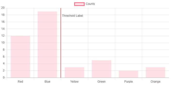
This is what you get
Including separators in your Chart.js visualizations is straightforward with custom plugins. This technique allows you to enhance your charts by highlighting important thresholds and improving overall readability. Experiment with different styles and positions to find what best suits your data presentation needs.